ShopDreamUp AI ArtDreamUp
Deviation Actions


Suggested Deviants


Suggested Collections


You Might Like…


Featured in Groups


Description
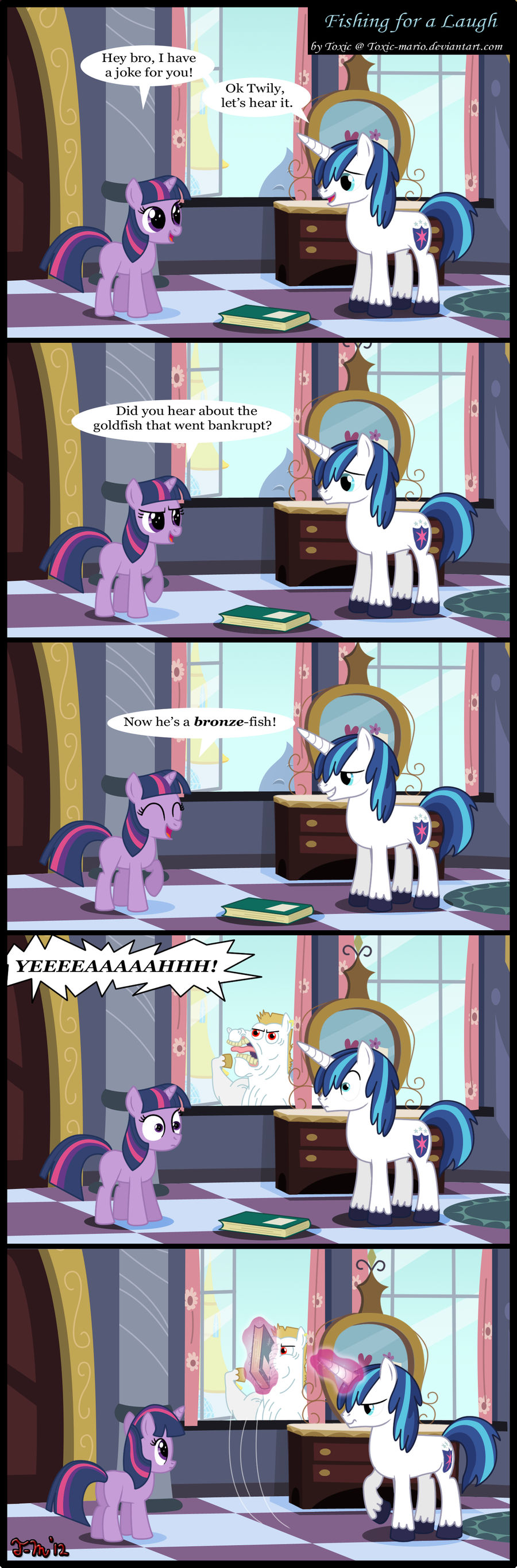
 Happy birthday to me. This comic is my birthday present I did for myself. I love it so much. Last Roid Rage comic for a while.
What better way than to combine Roid Rage, a spongebob joke, Shining Armor, and Filly Twilight all together into an epic comic. This was one of the more tricky comics to draw...mainly the BG. Still this comic came out much better than the paper sketches looked.
So yeah that's all I got. Time to celebrate my birthday. Comments always are appreciated.
Time spent: 24 hours over 4 days
How I did it: Paper + Photoshop CS5
PLEASE don't steal this. Remember to link this back to me if you put this on a site or something.
Twilight, Shining Armor, Roid Rage © Hasbro
Art © Me
Image size
1426x4327px 1.91 MB
© 2012 - 2024 Toxic-Mario
Comments638
Join the community to add your comment. Already a deviant? Log In
Well Happy Birthday, have a critique!
I can mostly say good things about this comic. The style is remarkably accurate, especially Twilight's mane in the very last panel in terms of perspective (if you readers are curious, go watch "The Cutie Mark Chronicles" and pause at 13:09). The lines are smooth, no bumps or uneven widths. The background looks like a lot of work went into it.
Now for a very short paragraph of the hiccups. The horn is a tad bit too pointy, try rounding out the end a little bit, and the distance from the fourth horn line (the one near the tip) shouldn't be too long, if you want you can watch the "B.B.B.F.F." song and examine his horn during the number. The next too don't really count as mistakes, just my preferences. You outlined the "YEEEEAAAAAHHH!" speech bubble, but did not do the same for the previous speech bubbles. It'd be nice to outline those too, to be consistent however either way there is no set standard. Any particular reason for the Times New Roman-ish font? Usually I see Comic Sans, oh well, no harm done.
On to the explanations!
Rating Explanations
Vision: It's a joke and therefore doesn't necessarily need to express a "point of view, theme, or idea." I don't see any of the aforementioned in this comic. Other than a long shot guess "the CSI 'YEAH!' jokes need to be used correctly and properly." I guess harkening back to the Spongebob Squarepants episodes of the Hillenburg era would count as a theme.
Originality: I don't remember seeing a comic joke in this genre where a joke is interrupted, so, four-stars (and a half) for you!
Technique: You progressed very quickly from your recent comics; being hand drawn along with my comments earlier, I can't think of any rating lower than 5-stars.
Impact: Nostalgia, laughter, and self-thought Maybe we should be moderate in using a lot of CSI jokes at one time? A good chuckle from a good (not good, GREAT) artist.
Congratulations on your birthday and on another great comic!